
Fresh LMS Platform Redesign
Overview
Fresh LMS helps users to build online learning platform that is designed specifically to create, distribute, and manage the delivery of educational content.
Role
UX Designer
Research, Interaction, Visual Design,
Prototyping
Problem Statement
The LMS platform is not intuitive and user-friendly, making it difficult for users to navigate and complete tasks. As a result, the retention rate is low, as users become frustrated and abandon the platform.
Goal
To improve the user experience and increase retention, the Fresh LMS platform should be redesigned to be more intuitive and user-friendly.
Understanding the problem
In order to understand the pain points and challenges associated with using the LMS platform, we did user interviews with existing course creators and also we got the feedback from internal Stakeholders.
Insights
Current platform interface is cluttered and overwhelming, making it difficult
for users to find the information they need.
Platforms is not intuitive to organise and structure content,
making it challenging for creators to present information in a logical and coherent manner.
Creators often lack access to detailed analytics and insights into
learner engagement and performance, making it difficult to assess the effectiveness of their content.
The navigation structure of platform is inconsistent, making it difficult for users to learn how to navigate the system.
Difficulties in uploading various file formats or media types, creating frustrations for content creators. limiting the diversity of educational materials they can provide.
Based on the user interviews conducted with 7 users on the existing platform,and from the stakeholders feedback we found the following key issues:
How Might We Statements
After Identifying the problem space, We have started creating HMW Statements before ideation to reframe our insights into opportunity areas.
“HMW simplify the platform interface to reduce clutter and create a more intuitive navigation system, enabling users to easily locate the information they need and enhance overall usability?”
“HMW simplify the file upload process to ease the frustration for content creators, enabling them to effortlessly share a diverse range of educational materials in various formats?”
“HMW provide content creators with comprehensive analytics and insights on learner engagement and performance to empower them in evaluating and enhancing the effectiveness of their content?”
The Redesign Process
During the process of redesigning the platform, we established a Design System as a foundation for creating a consistent, cohesive, and user-friendly experience and streamlining the design process by providing reusable components.
Grid System


Colors
Colors is designed in way it brings a unified and recognizable consistency, and it is grounded by a set of well-defined rules on how to work with the components and It has flexible range of colors to support our brand and product.
Primary Colors
primary palette consists of “Blue, Jet Black and White”. This colors are displayed most frequently across app's screens and components to provide accessibility, simplicity, and consistency throughout the Product and it helps to establish our brand.


Secondary Colors
Secondary palette consists of “Celtic Blue, Yellow Green, Princeton Orange,Blush and Rebecca Purple ”. Each color is selected with purpose in order to provide meaningful feedback within our products Such as Information messages, success, error, warning.


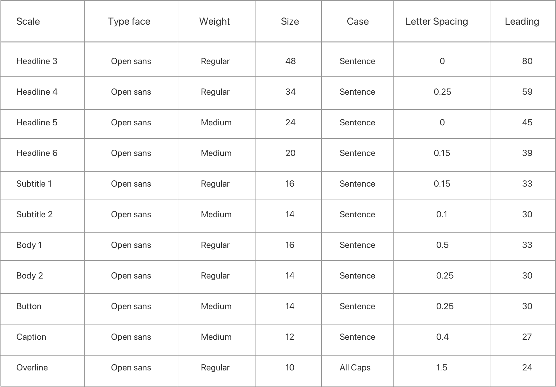
Typography
Open Sans Family
Open Sans is a humanist sans serif typeface designed by Steve Matteson, Open Sans was designed with an upright stress, open forms and a neutral, yet friendly appearance. It was optimized for print, web, and mobile interfaces, and has excellent legibility characteristics in its letterforms.
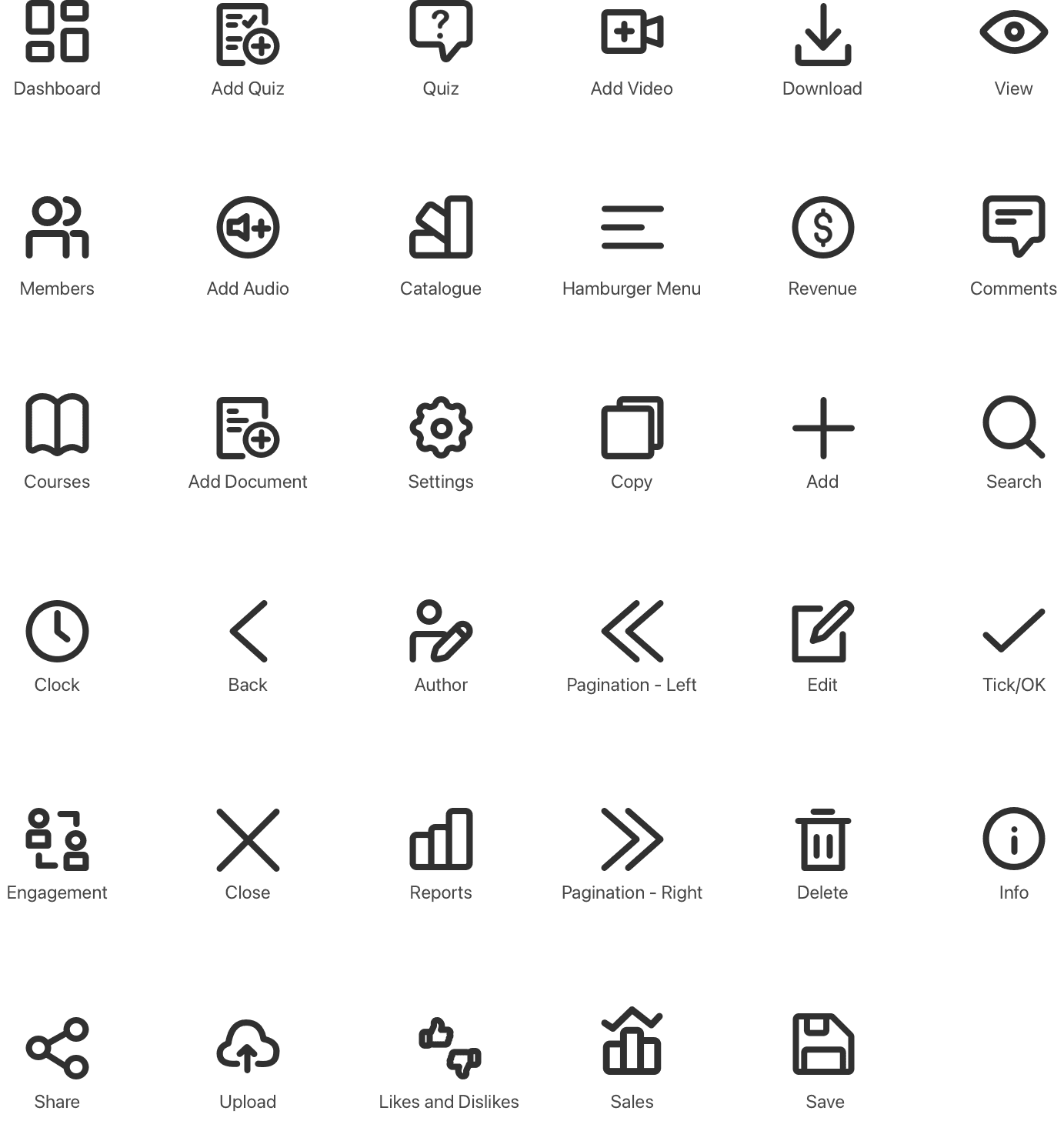
Icons
Icons are a crucial part of any design system or product experience. Icons help us quickly navigate. They are language-independent. Icons are designed to be simple, modern, friendly, and sometimes quirky. Each icon is reduced to its minimal form, expressing essential characteristics.
Components

Final Designs


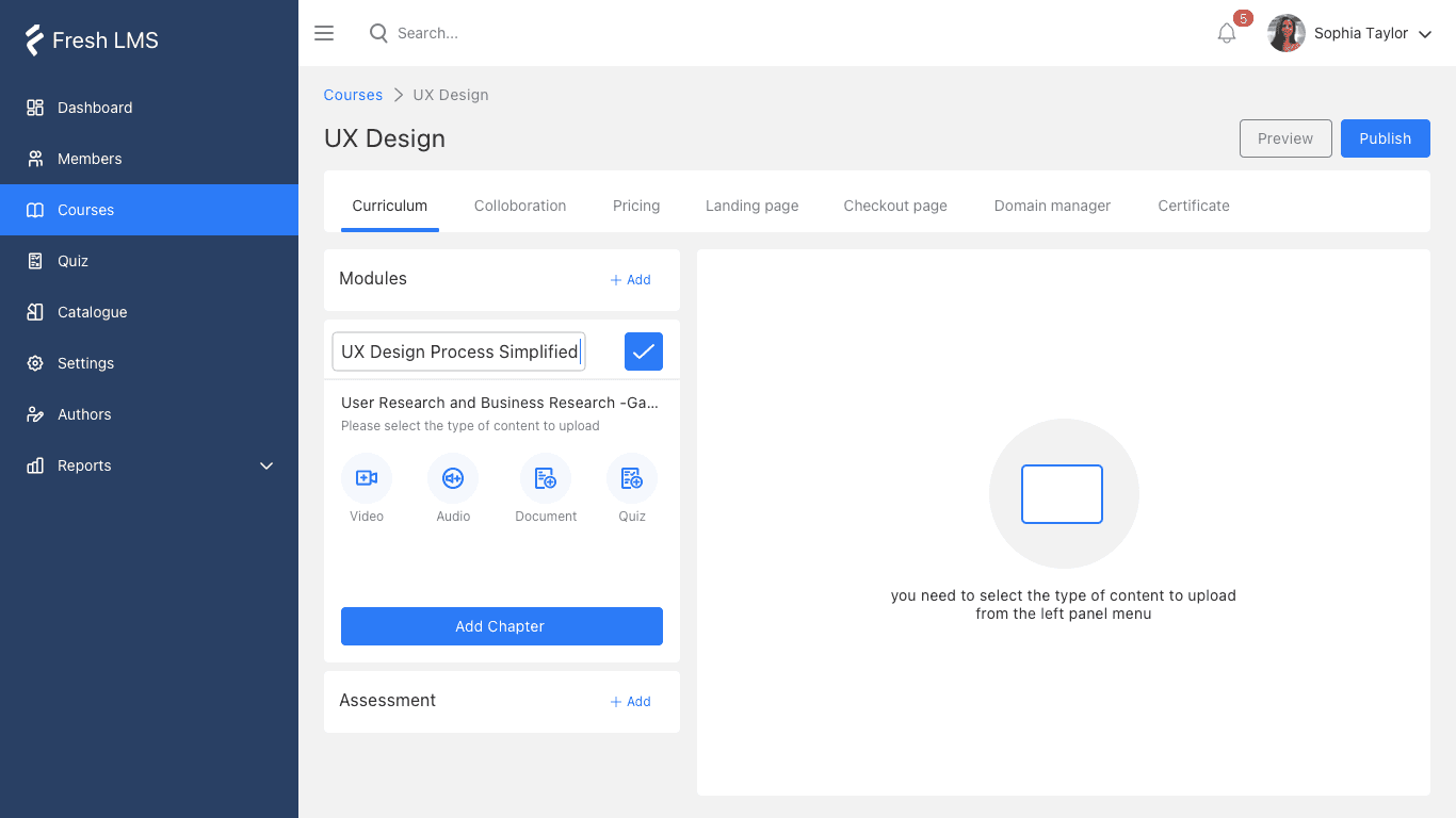
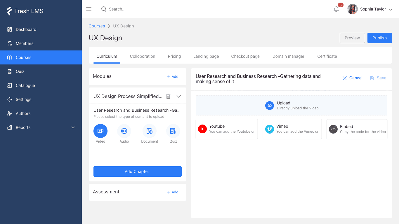
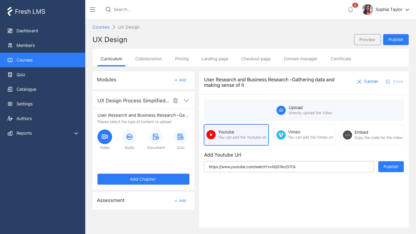


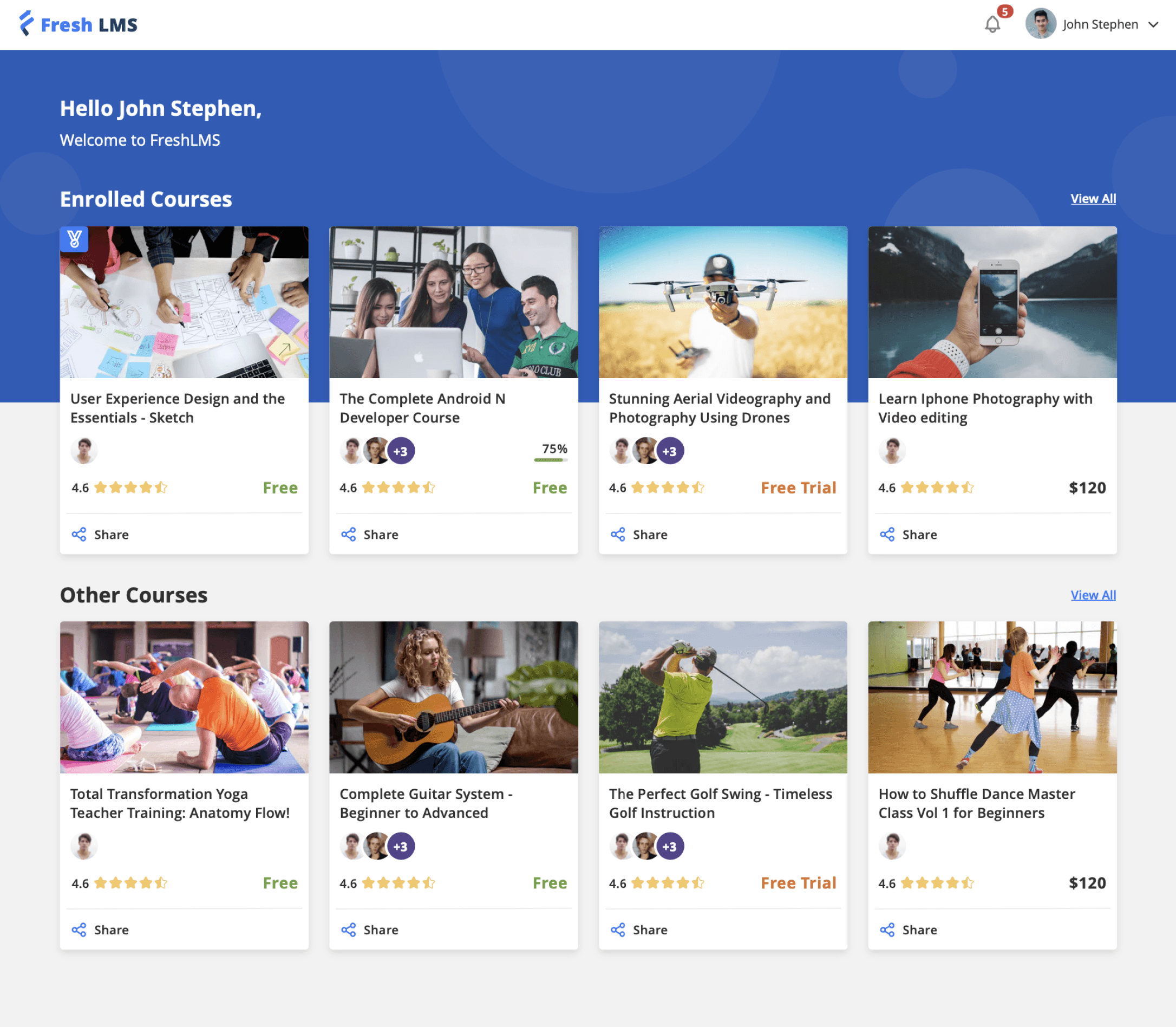
Course Creation Flow
Focus on building an MVP. In a startup, there is only so much time and effort that you can invest (especially when you're working full time!) so it's important to focus on the features that can deliver the highest value for your users.
Don't worry too much about the detail. Earlier in my journey, I made the mistake of worrying about the look of the UI. Taking a step back and reassessing the user flows helped me to reprioritise the UX.


My Key Takeaways